Brand Identity
Adobe Illustrator
Catalog
Photoshop | Indesign

Packaging
Photoshop

Webpage
Figma | Photoshop

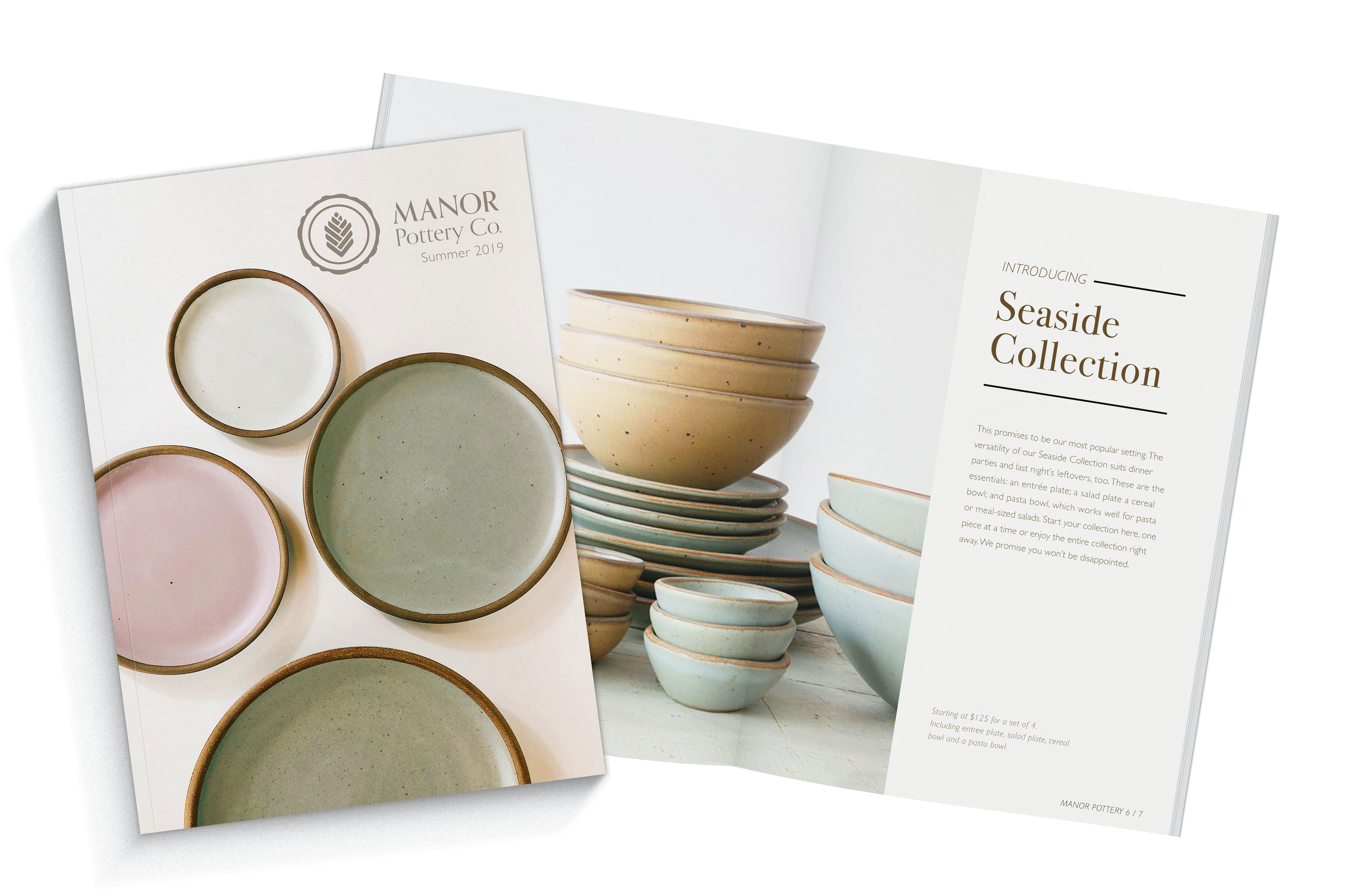
Brand Design Manor Pottery Co, a brand identity project, pulls color inspiration from sandy beaches, blue-green waters, and seaside sunsets. The pattern is both a representation of coastal flowers and sand dollars, and the logo, a sea oat, echoes the importance of community and creativity. The round, irregular edge around the logo represents a potters mark. A mark often found on hand-thrown pottery. It acts as a potter’s signature and illustrates creativity and pride. Finally, the selected typographic styles communicate a refined and sophisticated tone that appeals to an affluent demographic.